
Redesigning Grid
2023 - 2024
Grid is an app that helps users bridge the finance gap and get the money they need. Grid offers an expanding set of financial solutions, from credit-building tools and cash-back rewards to helping users reach their short and long-term goals. As Grid’s user base has grown, so have the products and services they’ve been able to provide. No longer being able to relate to their old branding, Grid wanted to redesign to a more lively, fresh, and innovative look that would make them stand out for what they stand for - their users.
MY ROLE
Rebranding, brand identity design, and product design
MY TEAMMATES
1 designer, 2+ engineers, 1 marketer, and the CEO
TOOLS I USED
Figma, Adobe Illustrator, and Photoshop
Context
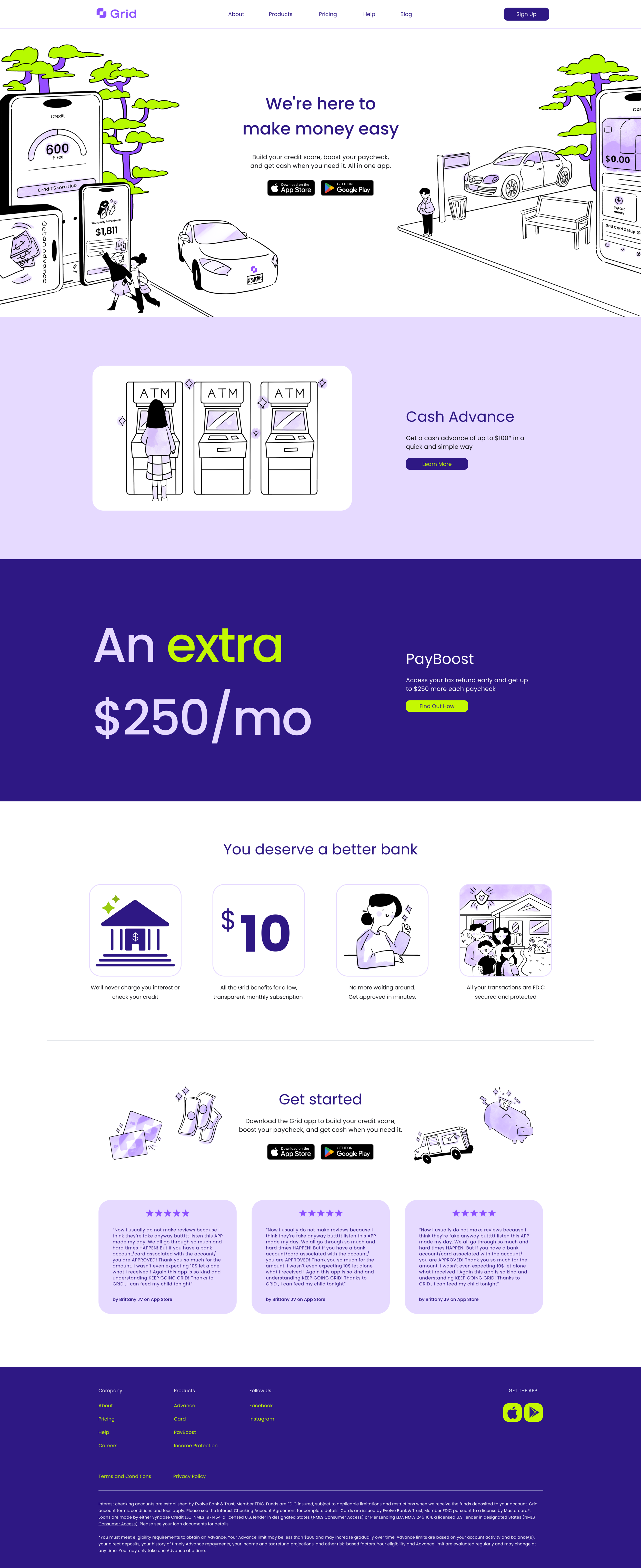
OVERVIEW OF THE NEW GRID HOMEPAGE
📖 Background:
I joined as a product designer, but my background in brand design sparked my curiosity about the company's future visuals. After exploring user feedback and employee ideas, I shared some of my illustrations and… it got the green light! I then took on an exciting and huge project: redesigning Grid's website and app. Over three months, with my teammates' support, I researched user improvements, aligned with Grid's old and new identity, created illustrations and icons, and wireframed a user-friendly look. After several revisions, we have a fresh new design!
💻 Stakeholders:
For this project, I worked very closely with the CEO so I could nail the vision he had for his company. I also would have creative critiques with head of marketing, software engineers, and product managers so we could make sure the work was doable but also stayed in line with the CEO’s vision.
🚩 Problem:
WHAT’S THE PROBLEM?: How to create a fun and strong style while making a platform that’s uncomplicated to use and showcases all the various products Grid has to offer?
User feedback that discusses other areas of focus:


These are the 5 main goals Grid wanted to focus on for the project:
Grid knew that we wanted to set apart from the usual color palette that’s used in finance - green, but still make it obvious to the user that this is a finance company
They wanted to stray away from the overly soft look without taking away the personality they had and make something that was more lively, strong, and soft around the corners
To incorporate the various services that Grid offers without overwhelming the user
Get to the point! Whether that was with copy or how long the content of Grid’s website would be, we wanted it as easy and digestible as possible
Most importantly, show trust. Handling money is something that’s very sensitive and needs to be shown with care, especially when you are dealing with your user’s money
The Process
AN INSIDE VIEW OF THE JOURNEY
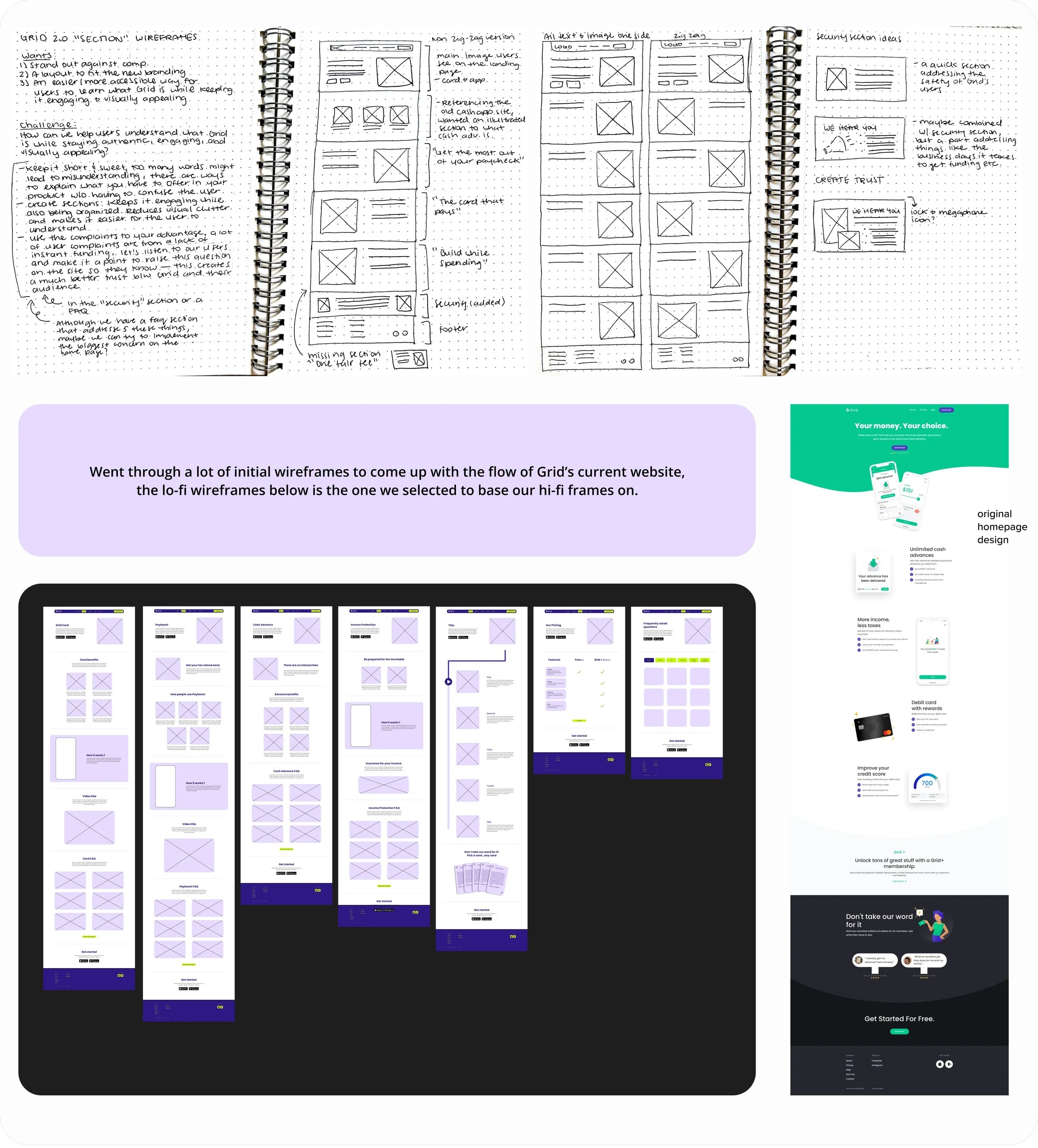
We started with:
Prioritizing user feedback that pertained to the old Grid website layout. What were things users had confusion about? How did the UI make them feel? Did they feel safe using the Grid platform?
KEY TAKEAWAYS:
💰 Most users felt as though they were scammed! The copy on the original design did not give an easy explanation as to how Grid’s services worked. While a lot of these reviews are for the app, the website had similar language and information. If a user is to check out a company’s page, it should be digestible and straightforward rather than hidden information.
☔ Going off of scammed, there was no trust and safety disclaimer on Grid’s website, how are users supposed to trust Grid if there’s no disclaimer provided? We needed to add this to the homepage.
🎨 A lot of users felt as though the old UI needed an upgrade. That it lacked an edge and was falling behind in terms of modern design while others would get us confused with our competitors due to similar green color palettes. There needed to be a way to make Grid stand out.

Design decisions:
After gaining insight from users and taking note on where Grid wanted their brand direction to head into, I started brainstorming and conceptualizing a series of color palettes and illustration ideas. I worked with our copywriter and marketing lead to form illustrations that would match the new tone Grid wanted to use on their website. After purple spoke to the new language, it easily became the new green and we landed on the concept above.
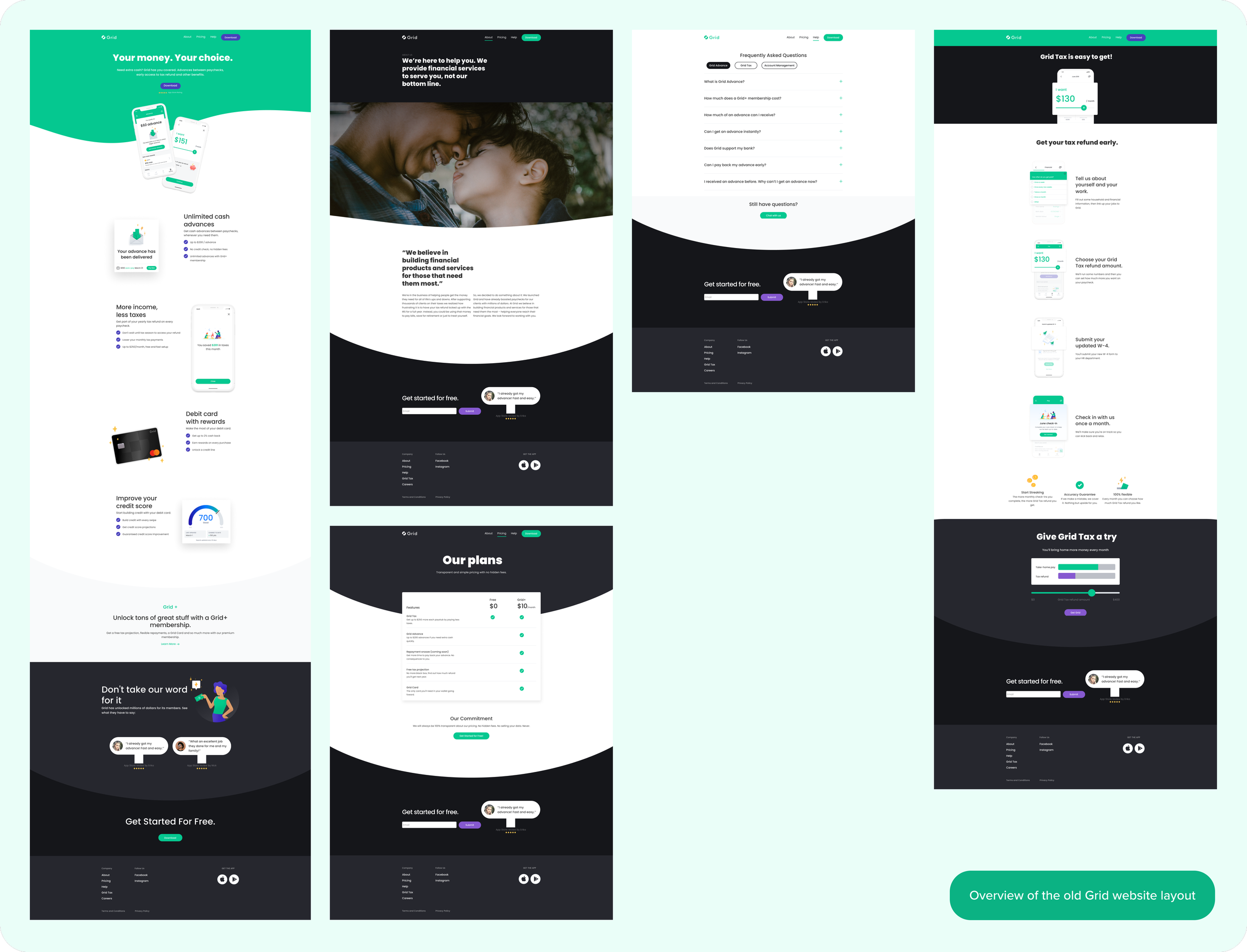
The OLD Grid Layout:
I took the time to break down each section of the old Grid website and see what was working vs not.
KEY TAKEAWAYS:
🌐 A lot of users dropped off after the homepage.
🤐 Users as well as other employers expressed how they were not a fan of the zig-zag method. They expressed that it created “confusion” as well as an “eye-sore” having to go back and forth between where the text and image were laid out.
💬 The reviews at the bottom seemed fake with generic images of people, and some comments in the reviews expressed that those positive reviews on the site were.
📖 The about page lacked a lot of critical information about the company and their products.
❓ The FAQ page left out a lot of answers to questions about other Grid services, how could we find a way to incorporate them all?
✨ The Design ✨
GRID’S NEW FEATURES THAT WE REDESIGNED FOR A BETTER EXPERIENCE
The NEW Grid Layout:
WHAT’S THE PROBLEM?: Grid offers a variety of services such as getting advances, offering Grid Card, earning rewards, and so on. How could we create an organized space without overwhelming the user?
As stated in “The Old Grid Layout: Key Takeaways”…
🌐 A lot of users dropped off after the homepage.
🤐 Users as well as other employers expressed how they were not a fan of the zig-zag method. They expressed that it created “confusion” as well as an “eye-sore” having to go back and forth between where the text and image were laid out.
SOLUTION: To create a memorable experience for users, we implemented a cleaner look that divided Grid’s products to focus on one feature at a time (video above). In addition, I added a “Learn More” CTA for screens where users can go to a product they were specifically interested in. This minimized other clutter such as the zig-zag method and kept our users engaged.
RESULT: We received positive user feedback on our new look.


Updated Navigation Bar:
WHAT’S THE PROBLEM?: Grid offers a variety of services such as credit building, getting advances, offering Grid Card, earning rewards, and so on. How could we create an organized space without overwhelming the user?
SOLUTION: In terms of the navigation bar, a lot of products would go overlooked with the old design. This is because they were in the footer. The team decided to expand the navigation bar by placing the tabs front and center and creating a drop-down for the products tab - making it a much more effective way to get looked at.


reviews ⭐⭐⭐⭐⭐:
WHAT’S THE PROBLEM?
As stated in “The Old Grid Layout: Key Takeaways”…
💬 The reviews at the bottom seemed fake with generic images of people, and some comments in the reviews expressed that those positive reviews on the site were.
SOLUTION: Source, credit, and pin to where these reviews are found. Whether it’s Google Play or the App Store, Grid does not want to provide misleading information so a better way to create trust is for users to hear from other users. Also as a way to reduce the amount of space in the original, I added the app store icons to go along with the reviews under the header


About Page Update:
WHAT’S THE PROBLEM?
As stated in “The Old Grid Layout: Key Takeaways”…
📖 The about page lacked a lot of critical information about the company and their products.
SOLUTION: With the help of our copywriters, I was able to format these pages in an easily digestible way. I felt as though this copy allowed us to explore personal designs and include extra information to let the user know who Grid is.


Adding Trust & Security:
WHAT’S THE PROBLEM?
As stated in the “We Started With: Key Takeaways” and “The Old Grid Layout: Key Takeaways”…
💰 Most users felt as though they were scammed! The copy on the original design did not give an easy explanation as to how Grid’s services worked. While a lot of these reviews are for the app, the website had similar language and information. If a user is to check out a company’s page, it should be digestible and straightforward rather than hidden information.
❓ The FAQ page left out a lot of answers to questions about other Grid services, how could we find a way to incorporate them all?
SOLUTION: To add a section just for security on the main homepage and ease a lot of user’s concerns. On top of that, we added multiple CTA’s to organize within the “help” tab on the navigation for users to search for more in-depth and clearer answers on what they are looking for. Grid wants to alleviate the concerns of their users and provide solutions without having them have to contact support but offers support’s contact or the chatbot in case the user’s answer was not provided.


Conclusion
THANKS FOR MAKING IT THIS FAR
🌟 A HAPPY ENDING:
RESULTS: Since the website and app has gone live with the rebrand, there has been a 2,200 app download increase. Starting around 1,200 downloads a day to 3400 app downloads a day.
WHAT I LEARNED: Throughout my time working on this project, my understanding of design vs bias vs companies’ wants vs what’s important for the users has increased tremendously. This was a very insightful and fun project that I not once had a dull moment on. As a product designer who’s always finding ways to improve, the growth that I experienced on this would not have happened if not for the feedback and numerous amounts of revisions I went through. Designing is a tough job - there are a lot of opinions that go into it and becoming a decision-maker for what’s best for the company AND users is no small ask. Learning to share my points of view and design decisions was an important part of my communication growth. You can not place what everyone is asking for so it’s good to know when to push back on feedback from higher-ups and other coworkers. It was a complete honor to have worked on a project from beginning to end and it’s not even over yet.
I worked on…
The website, mobile version, and redid the whole UX UI of the app with the new branding, please take a look at the most up-to dates below!